When you think of the word “wellness” you may think of a trip to the spa, or the mountains, or maybe wellness is your weekly yoga class. But can wellness be incorporated into your home? What does that mean, exactly? The Random House Dictionary defines wellness as “the quality or state of being healthy in body and mind, especially as the result of deliberate effort.” Wellness and well-being can be thought of as the act of purposefully creating a state of feeling good.
You might already have a wellness room in your home without knowing it. Perhaps it’s the kitchen or the garden where you feel creative, connected and inspired. Maybe it’s the oversized tub where you relax and unwind at the end of the day. It might even be that cozy nook by the window where you love to sit and read. At a recent trip to Heimtextil, design experts from all over the world and across multiple disciplines designed a special exhibition called Well-Being 4.0. They focused on that which makes us feel protected, energized, nourished and enriched. Given these descriptives, you’d be amazed at how right color strategy in your home can influence your well-being and help create a stronger sense of wellness for you and your family.
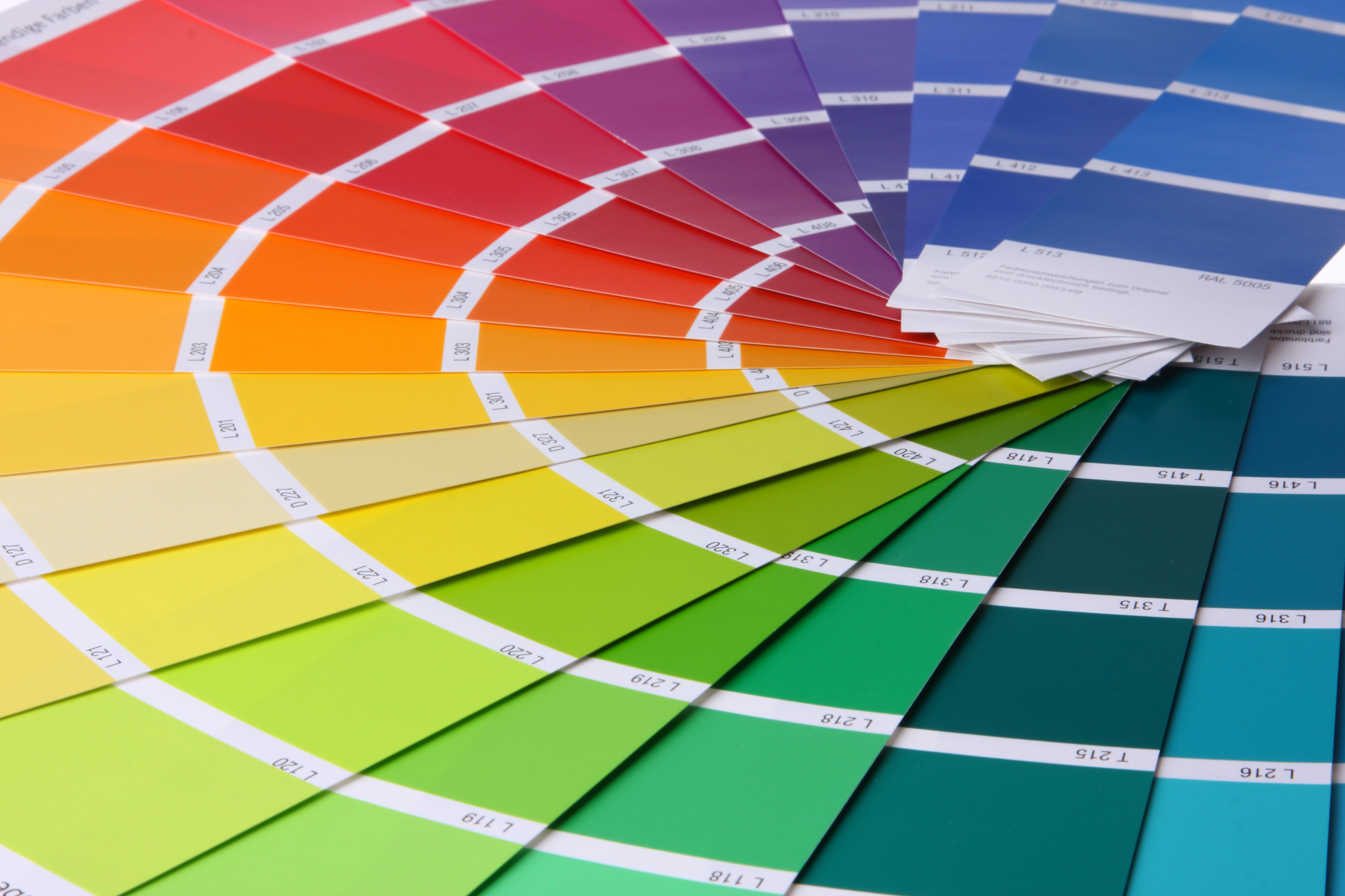
Whether you are aware of it or not, color plays a huge part of your life. From the clothes you put on in the morning, to the foods to buy at the grocery store, to the brands you reach for in the pharmacy, color is influencing you constantly. In fact, brands hire color experts when launching new products or when entering a new marketplace. Experts know that the colors of the package can increase, or decrease sales.
The colors you pick for decorating your home, inside and out, influence your overall well-being too. You’ve probably purchased a colorful trendy paint you saw in a magazine only to realize that in person the color gives you a headache, or makes the room feel dark and depressing. Your very perception of color can really make or break a room, so to speak.
Color experts know that our perception of color (or rather, our perception of light) stems from many core values that have evolved over a long period of time. At the Heimtextil conference I listened as color expert, Carola Seybold, from the color authority company Pantone, explained the psychology of color:

Frank H. Mahnke was a founding member of IACC (International Association of Color Consultants/Designers), which aims to bring color education and expertise into the world of design, including interior design. The pyramid above shows how much influence certain factors, like cultural influences, may have on your love of certain colors.
- The strongest influence, Mr. Mahnke describes, is our biological reactions to a color stimulus. Think of the luscious, bright red colors of sweet berries that our ancestors foraged for quick bursts of energy. Red is also one of the main colors used in restaurant design, since it makes customers feel hungry, encouraging spending.
- Less influential than that but still very strong is our collective unconscious, which would include the examples of orange and red, which signify the colors warmth and security of a roaring fire.
- Conscious symbolism – associations is like how children always color the sun yellow, and that we still equate that color with a sunny point of view.
- Cultural influences and mannerisms refer to the colors that become symbolic within our own distinct cultures. The color white, for example, represents purity in the U.S., and is used for wedding dresses and baptismal gowns. However in Japan, white is the cultural symbol of mourning, and people wear that color when attending funerals.
- The influence of trends, fashion and styles are less important but still may influence our color choices. This is easy and obvious to see, particularly when a photograph of a movie icon on the red carpet spawns a whole industry of new dress designs.
- Finally, our own personal relationship to color, although the least influential, is still important. If you’ve always hated the color of orange because you had a bad experience with something that was a dominant color orange in your memory bank, you may never like that color.
Of course, understanding this pyramid of influence is just one part of why we like certain colors in our home. But it’s an important idea to grasp when thinking about how certain colors in your home can make you feel protected, energized, nourished and enriched – in other words, make you feel well.
Color is merely our perception of light, and as we age our perception of color, or our ability to remember color, may change. Hospitals, for example, are experiencing the effect of color with patients suffering from memory loss. In fact, memory and color are closely intertwined. If you don’t find this compelling think about how large parking garages use color to influence your ability to remember where you’ve parked your car. Our brains can only pay attention to small amounts of information at a time, that is exactly why brands rely upon color to impose their brand on your brain.

The above example by design company Printsome shows just how powerful color can be on our memories. Check out their other brand color-swap examples; what does your mind think when the Starbucks logo is illustrated in Dunkin’ Donuts colors? Does your mind switch brands?
Despite this information about color and memory, Ms. Seybold also mentioned that it may be hard to describe why, exactly, we like a certain color more than others. Studies have shown that when shopping, 93% of consumers place visual appearance over all other factors. 85% of shoppers say color is the primary reason for selecting a particular product.* Within seconds our brains can recognize a brand before we even register the letters or logo.
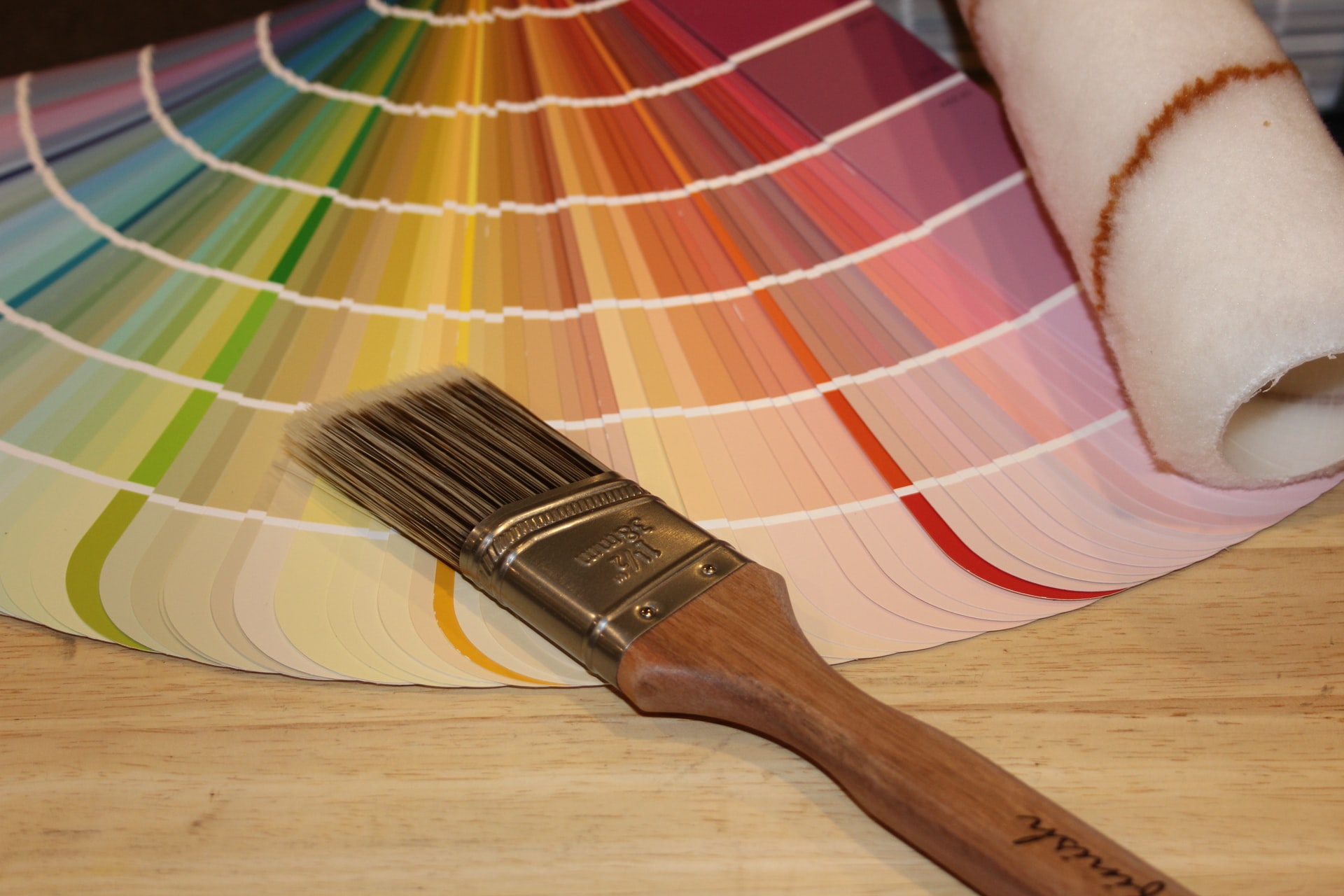
So how does all of this help you choose the right colors for your home? How does this help you create a state of well-being in your living room, kitchen or home office? It’s important that you go with your gut (your biological reaction) when selecting linens, paint colors or upholstery. Choose colors that make you and your family feel good and remember that in a room full of furnishings you have many opportunities to influence the overall color palette. You may choose earthy neutrals for your long term investments like carpeting or flooring, and you may want to experiment with “new” colors in the form of inexpensive accessories that can quickly be replaced.
Leatrice Eiseman, Executive Director of the Pantone Color Institute, head of the Eiseman Center for Color Information and Training, and author of nine books on color, understands that feeling good about your interior colors is not necessarily about choosing one color over another. It’s important to play with the right shades and tones for your own home. “It’s a mistake to simply rely on paint swatches,” she says about choosing the right color paint for your walls. Test out paint samples on the wall or on sample boards and live with it for awhile. Take note of how the color changes with the light of day and how it works with the bounced light from your furniture. Ms Eiseman recalled that when living in sunny Los Angeles she loved a particular shade of yellow she chose for her home. When she moved to the Northwest, she still kept yellow as a primary color but had to adjust the shade in order for it to work well with the grey lighting of the cloudy Northwest.
Here are some great tips for choosing the right colors for your home:
- Take your time. You should never feel rushed when buying fabrics, linens, furniture, carpeting or any interior furnishes for your home. Use Pinterest to create color boards or cut out magazine images. Putting your gut feelings down on paper is the best way to gain focus and identify how you respond physically and mentally to particular colors or color combinations. Using a professional interior designer can help speed up the process, however, you still need to know what colors you do, and do not, like. Read more tips for working with an interior designer.
- Always bring home swatches. Most furniture companies have fabric samples that you can bring home. Not only is this a great way to see how your family reacts to the color, it’s also a great way to see how it works within the room. Read more about samples and swatches here.
- Don’t choose paint colors in the store. The biggest mistake is to pick out your paint chips in the store without testing it out at home first. Even if you have to purchase a small quantity of paint to test at home, it’s worth the money to paint part of your wall or paint a sample board. This same idea should be used when selecting wallpaper as well. Read more of our painting tips here.
- Hire a color consultant. Color consultants are definitely a worthwhile investment, especially when you need to make a lot of color decisions at once. If you are repainting the whole home, for example, or building a new home, this is a great opportunity to learn more about the colors you love and how to settle on the correct shades. Find an expert here.
* Source: https://blog.kissmetrics.com/color-psychology/?wide=1
Other sources:
International Association of Color Consultants/Designers https://iaccna.com/
Pantone http://www.pantone.com/pages/pantone/index.aspx

