The Spring 2015 Pantone Fashion Color Report is a lesson in the power of creativity. Soft and cool colors with hints of warm hues, offer endless opportunities for decorating just about every room in the home. The palette’s En Plein Air theme even caters to minimalists who prefer more subdued looks.
From your kitchen to your bedroom, get inspired to decorate with these Pantone color palette suggestions.
1. Pantone 16-1720 Strawberry Ice
While painting your walls pink can be flattering, if you’re uneasy with with such a bold shade, stick with an accessory like a side chair. More adventurous decorators can take it a step further by pairing the chair with a complementary shade of wall paint.

2. Pantone 14-4102 Glacier Gray
Bedrooms are for calming colors like gray. It’s a classic shade that adds a greater level of interest than your typical beige neutral. Glacier Gray shines best when in the company of white accessories and a dose of more vibrant colors like purple.

3. Pantone 13-0720 Custard
Yellow instantly makes a room feel fresh. A pop of Pantone’s Custard color for an accent wall can brighten the kitchen or dining area and create a charming atmosphere. For a chic look, pair the hue with Pantone’s Classic Blue or Marsala.

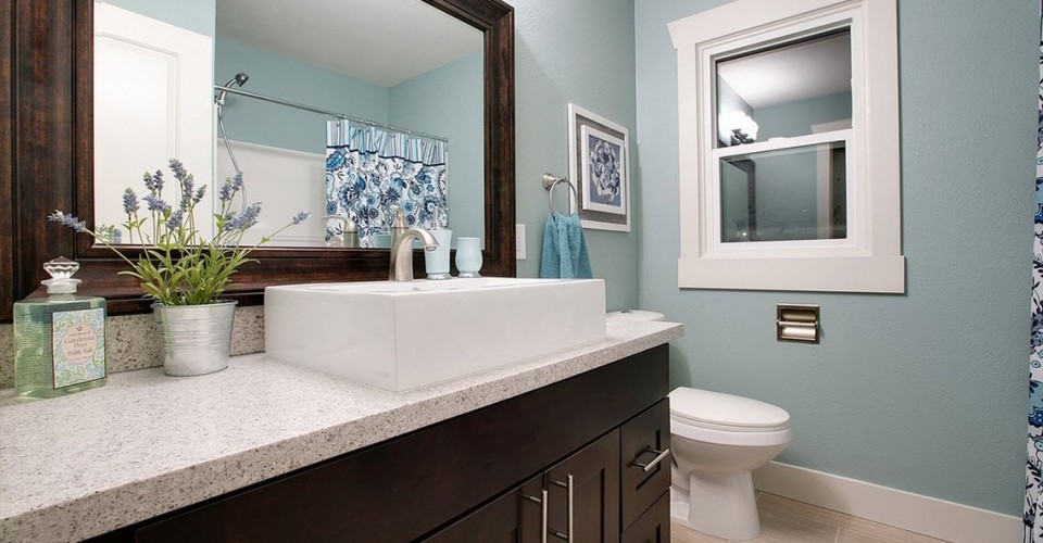
4. Pantone 14-4314 Aquamarine
Aquamarine is a shade of blue that gives off a relaxing vibe, making it appropriate for walls in a guest bathroom. This diverse, yet ethereal shade works well with colors ranging from light neutrals to deep chocolate brown shades.

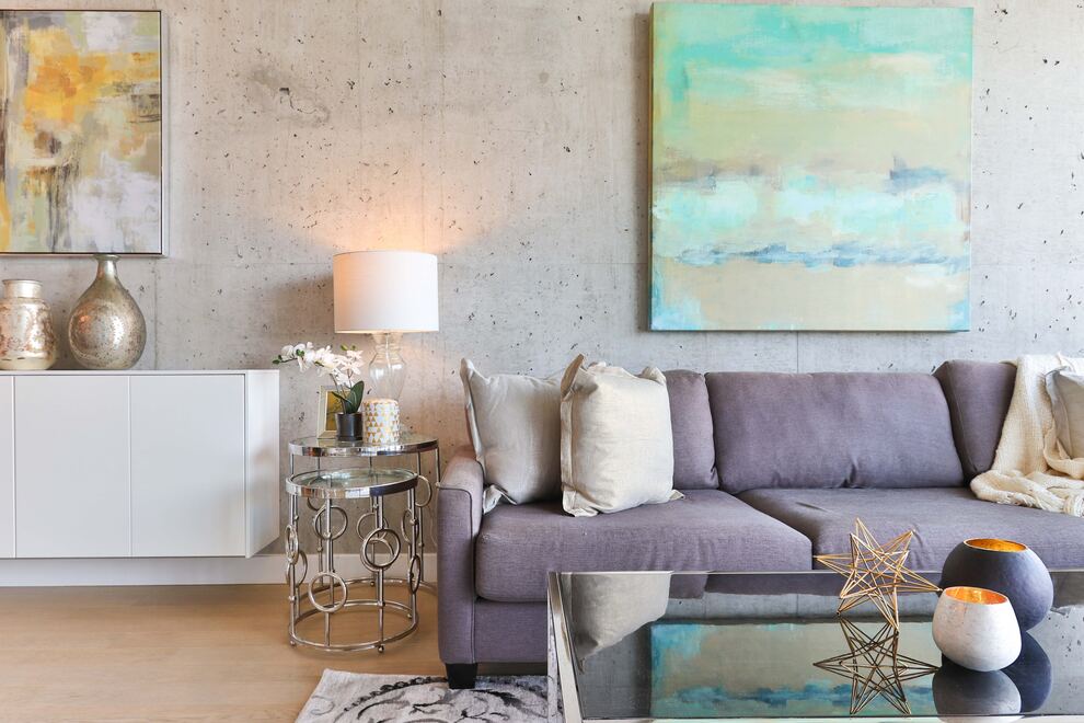
Want to see more from the Pantone palette? Check out this Pantone Spring 2015 colored home.
How would you decorate with Pantone’s Spring 2015 colors? Tell us below in the comments!
Top Image Credit: Spane Construction LLC

