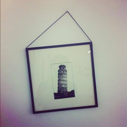
Does this picture bother you more than it should?
If it’s still messing with your head, I’m right with you (I’d suggest scrolling down) – the section ahead will put your mind at ease.
Symmetry and visual aesthetics are incredibly powerful tools in design, as the Leaning Tower just proved- most of us would prefer things to fit perfectly side by side or up right, and our minds accept things if they are in order. For the lovers of the abstract and chaotic out there- I empathize with you, but this post is aimed at the rational and OCD design enthusiasts.
So what is it exactly that makes architectural symmetry so appealing? Leonardo Da Vinci’s famous drawing perfectly illustrates that the human mind and body portray symmetry as perfection. When you see a building that wonderfully mirrors the left side to the right, it doesn’t look like much when you’re at the wrong angle- but shift your perspective in the dead center of that symmetry and you instantly understand what the architect was trying to portray. This article explains the importance of architectural symmetry in further detail.
The Leaning Tower of Pisa is a great example of brilliant architecture, although accidental, because it’s unintentionally and perpetually frustrating to the human mind. Compare a picture of the Leaning Tower to one of the Taj Mahal, and you’ll instantly notice the incredible architecture of the latter. The human mind doesn’t only value symmetry in structural architecture and design, but in human attractiveness, nature, and every other visual stimulus. If you’re a fan of The Office, this episode comes to mind (Oscar argues in favor of Hilary Swank’s attractiveness due to her symmetrical face).
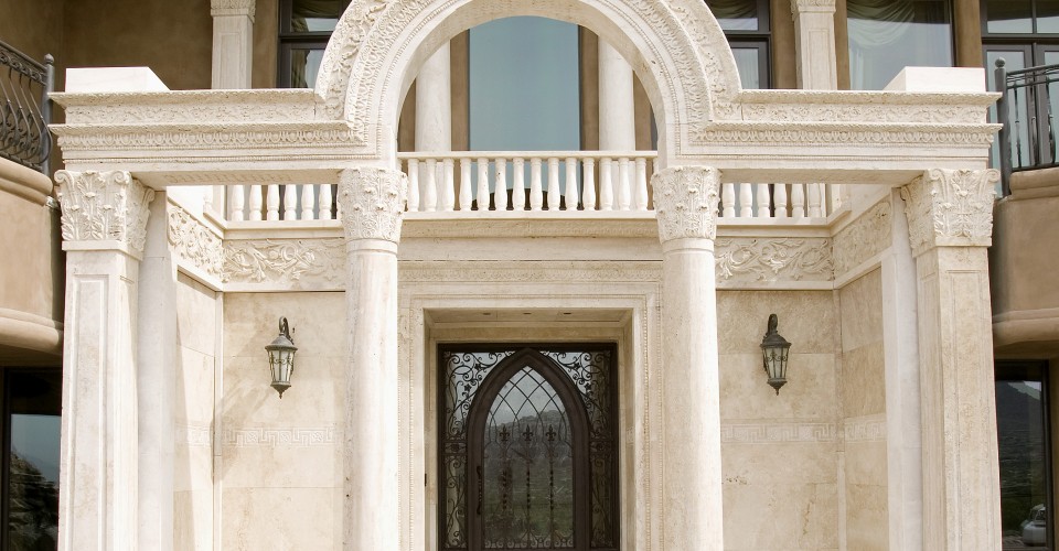
The following are some of my favorite featured Porch Projects that utilize symmetry magnificently.
Westlake Luxury by Schill Architecture
NeMo by Phil Kean Design
Avon Lake Masterpiece by Schill Architecture
Highland by Phil Kean Architecture
Miami Beach Interior Design by SoJo Design
Highland by Phil Kean Design
Hopefully this post has helped you understand that wanting things to look perfectly in order is not a bad thing, although very hard to replicate in your own home. These designers have shown that symmetry is one of the most aesthetically appealing design techniques out there, and hopefully helped you gain some peace of mind after that mind boggling picture (of a picture) of the Leaning Tower.
Top image credit: World Wide Stone Corporation


