
The impact of color in a home can be subconscious yet significant. Paint color can guide our moods and dispositions, while also setting the tone and foundation for additional decorating. Choosing paint colors doesn’t need to be stressful, even though it can seem daunting at first. Showing off your color style can be fun with one of these three approaches.
1. Monochromatic Shades: Variations on One Color
This approach tends to be easiest for the color-shy. With a plain room, like the photo above, the focal point is all about the green plants. A monochromatic choice of paint would be another green shade.
2. Complimentary Colors: Opposites on the Color Wheel
“Complimentary colors” may be a phrase you recall from art class. These are simply colors that fall opposite of one another on the color wheel (see image below). Using the green plants in the photo above as the focal point, just find green on the color wheel. Directly opposite from green, notice that pink is its complimentary color. A great hack for choosing complimentary shades on color wheel is to use a similar boldness and saturation for each shade. Against the clean, white decor such as the room above, a deep pink wall with deep green plants would really make the green accents pop.
3. Neutral Tones: Versatile and Classic
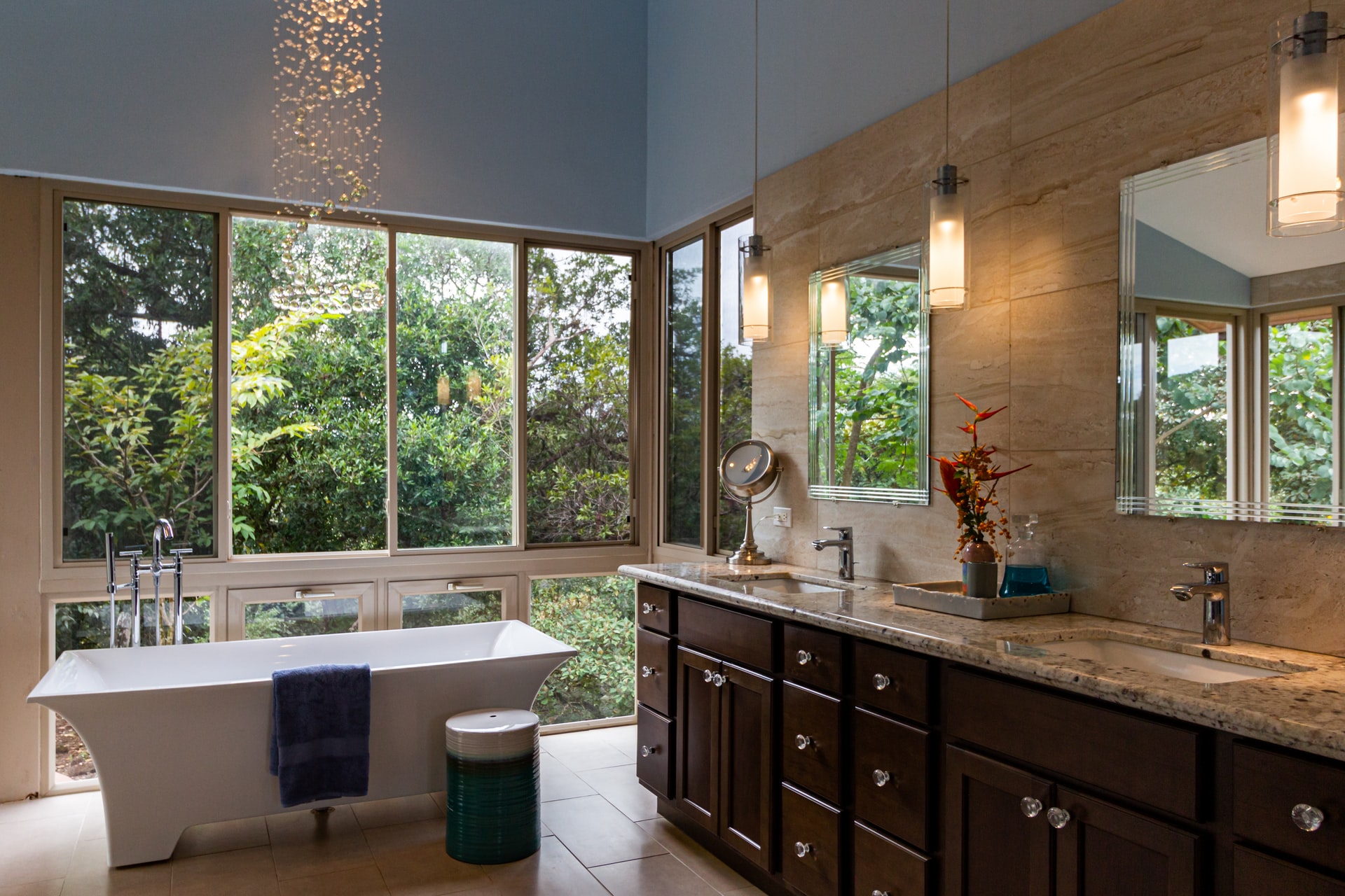
Sometimes you’re not ready to decorate yet, but you still have to choose a wall color. Maybe you really like to move your furniture around and aren’t sure what featured piece will stand out best. Or maybe you prefer a minimalist look. Don’t worry! Neutral toned paint colors are the answer. The word neutral means “without color” in this case, and these tones can help show off decorative pieces to pop against a subtle backdrop. These color classics include beige, grey, whites, black, and browns, and offer decorating flexibility for years to come.
This is a guest post by Kelley Lauginiger, a lifestyle blogger at American Freight Furniture and Mattress.


