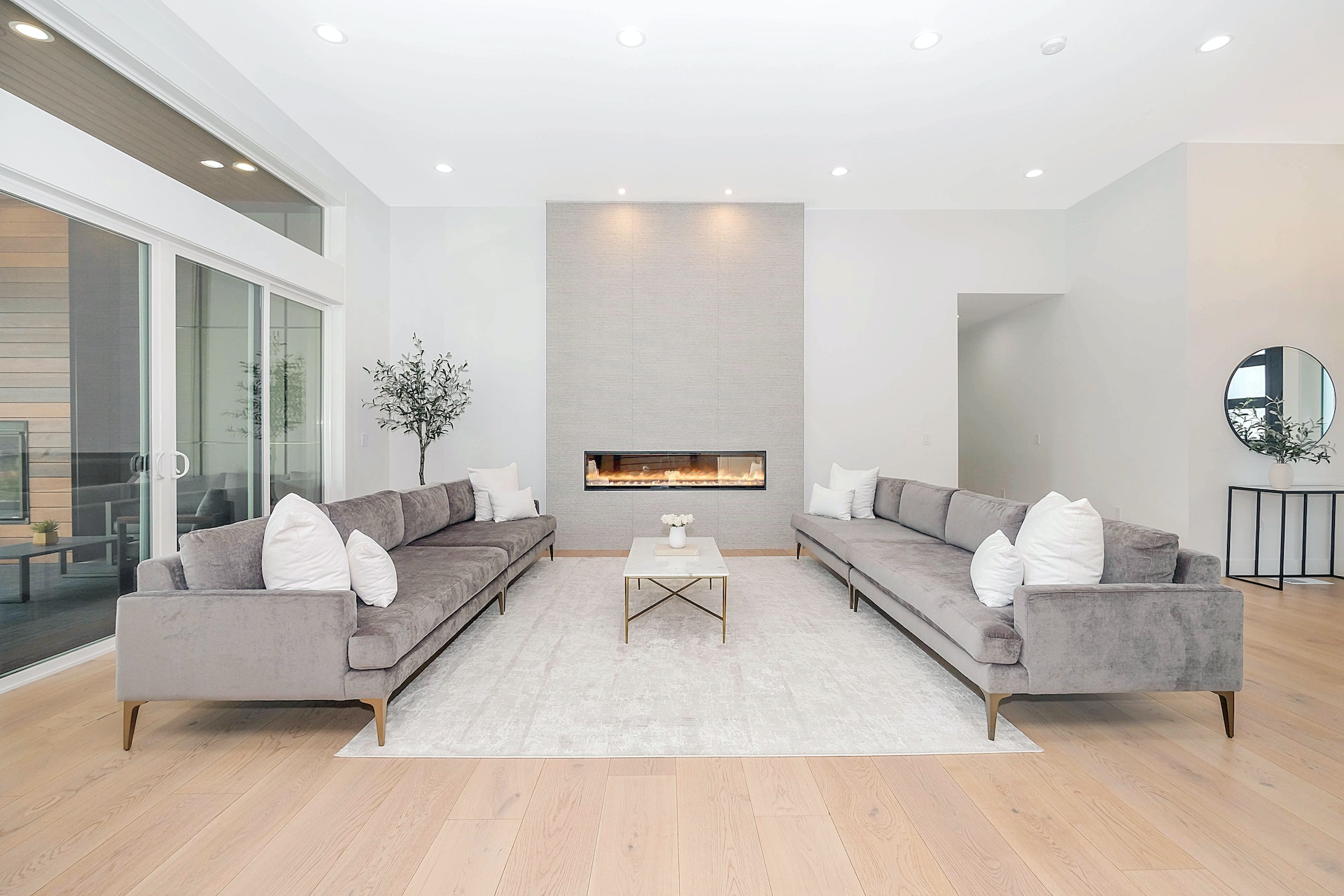
If you’re passionate about design, it’s easy to forget how the “average person” approaches the décor of their home. To get an idea, simply take a walk around any neighborhood and you’ll notice two things: A weird lack of curtains, and a near-allergy to wall color beyond white or beige.
Until we moved in together, my fiancé was one of those people who never, ever painted. “Why bother? The walls are already painted,” he said, referring to the Apartment White walls of our tiny apartment.
Becoming a Color Convert
A month later, I surprised him with a can of medium-aqua paint that brought to mind a mid-century hotel in Miami. He was skeptical—but within a few hours, the apartment looked bigger, happier, and more like a home than the temporary residence that it had been. It worked perfectly with my Lucite bar cart and his collection of vintage comic book art. After that, my boyfriend was a color convert.
I can understand the general reluctance to paint. After a decade of writing about décor, I’ve heard all of the complaints. Color is a pain to pick out, since there are roughly thousands of shades and swatches to choose from in the paint aisle. No one looks forward to the project. If you live with anyone else, you have to account for their personal preferences. Even kids have an opinion on the subject.
Yet, paint truly is the easiest (and cheapest) way to make a room look entirely different. If you’re currently vacillating between beige and beige-er, take a moment to consider any of these easy, low-commitment, beautiful shades. They’re not only part of Valspar’s 2015 top color trends (selected by celebrity designer Genevieve Gorder), they are also universally flattering.
Soft Aqua
The Paint: Pictured here (on walls, floors, and ceiling), Valspar’s “Aqua Glow” and “Belle Grove Sorbet”
Perfect for: Dining areas, living rooms, bedrooms, bathrooms.
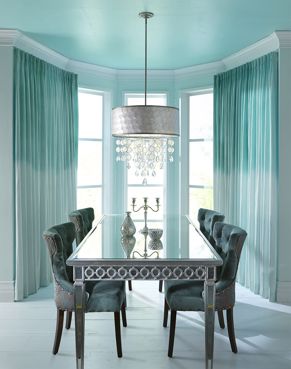
I know what you’re thinking: That is A LOT of blue in a space. But it’s actually a very soft blue that would feel muted if kept to any one element in the room – the walls, or the floors, or the ceiling.
The shade brings to mind a lighter version of the classic Tiffany box, and makes any room appear bigger and brighter. It complements dark, light, and even metallic furnishings. Note: Since the color can appear to amplify sunlight, light aqua isn’t an ideal hue for bedrooms (unless you’re a morning person).
Light Peach
The Paint: Pictured here (on banquette), Valspar’s “Coral Gable”
Perfect for: Adding a pop of color

Somewhere between yellow and orange exists this light peach hue. It’s sunny and cheerful—but a little can go a long way. See how your eye is drawn to this bench, even though there’s a big white wall there? This color is perfect for re-painting a vintage find, a front door, or as an accent. I also like to picture this in the kitchen of a vintage bungalow.
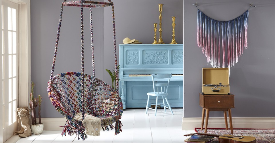
Rich gray
The Paint: Pictured here (on walls), Valspar’s “Cinder Fox”
Perfect for: Living rooms, bedrooms and dining rooms
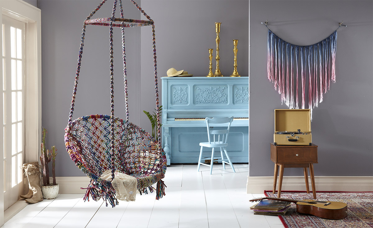
No, it’s not “gloomy.” Gray has the fantastic ability to make every single color around it look even better. Check out the way it brings out the cool blue of the piano and chair, or the dazzling gold candlesticks. Gray also gives your eye a rest, making it ideal for bedrooms.
If you’re scared of color, you probably won’t want to commit to painting a whole room. That’s okay! You can always start by turning a single wall into an accent wall. A good place to start is the wall behind your sofa. If you can live with the color, paint the rest of the room. If not, it’s easy to paint over. Happy painting, and enjoy your new wall color this spring!
Top Image Credit: Valspar
What’s the color you always recommend to friends? Share it with us in the comments!
