Q: Any tips for picking the right style of wallpaper for a gallery wall? How do you make sure you don’t clash with the pictures?
I’m going to answer this question with another question: what do you want your gallery wall to look like? Just like fashion, there are few “wrongs” in interior design, or wall design, as the case may be. There are many ways to show off your art so that it both compliments your home as well as compliments your own personal style and taste.
A gallery wall, named after the style of hanging artwork inside a gallery or museum, is a great way to show off your collection of artwork, prints, photographs or favorite pieces. Some homeowners prefer to showcase like items, such as a collection of black and white photographs or framed pages from a vintage book. Other homeowners aim for an eclectic style, and display an eclectic collection of artwork, photographs or prints.
How to display your artwork
The first question you’ll want to ask yourself is what is the overall look you’re going for? Do you want a symmetrical, proportioned or balanced look? If so, you may want all of your frames to match or hang all the frames in a neat and orderly arrangement. Or are you going for a busy, fun collection? In that case, you could use a random assortment of frames, matting styles and hang the pictures seemingly randomly on the wall. Either style will go well with wallpaper, but the overall appearance of the wall will change depending upon the wallpaper patterns and colors behind it.
A true gallerist has to decide what type of background will not only compliment the artwork and frames, but how the background will influence the storytelling of the gallery wall. For example, a gallery showcasing 19th century Victorian paintings might want to hang the artwork against wallpaper pattern that reinforces the style of that time, helping the viewer to understand the artwork better. But a collection of modernist artwork might look best on a plain white wall, where the entire focus will be just the artwork and nothing else.
The effect of wallpaper in the room
The second question is what type of wallpaper do you want for the room? Wallpaper is generally more assertive than paint, but you can certainly tone down or play up patterns and make the wallpaper really dominant or more unassuming by playing with the repeat size, the color contrast of the patterns, or the texture.
When shopping for wallpaper, bring color samples of your room such as fabric swatches or paint chips. Wallpaper companies tend to print different patterns within a color “family,” which makes it easier to ensure you’re mixing and matching the right colors. Ask the wallpaper vendor if you can bring home samples to view inside your home – you’ll want to see how prominent the pattern is and how your frames and artwork might look next to it. Wallpaper is a bit more of a process to install compared with paint, so spend time ensuring you love the pattern.
Let’s take a look at how these homeowners have hung a gallery wall on top of wallpaper:
 A dark wallpaper with a prominent repeating pattern is the perfect backdrop for this collection of black and white photos. The wide, white matting around the photos help the images stand apart from the high-contrast wallpaper pattern. Image courtesy of Hyde Evans Design.
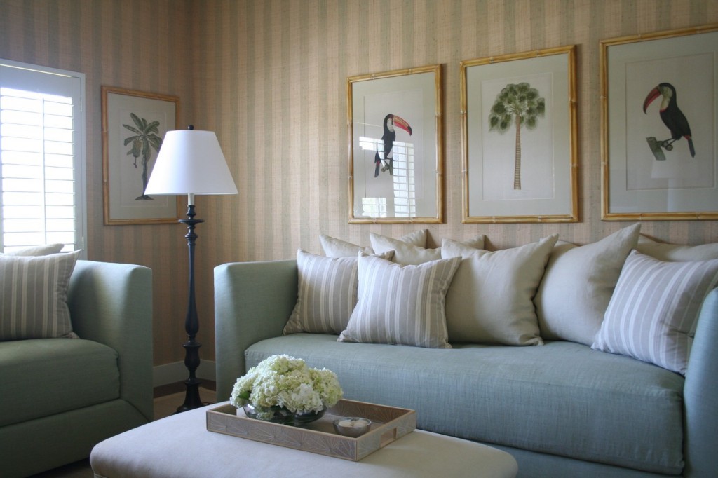
The strong striped pattern of this grasscloth wallpaper, paired next to subdued upholstery, makes a calm and peaceful space statement. This gallery wall is unified with matching frames, matting and type of artwork. Image courtesy of Foley & Cox Interiors.
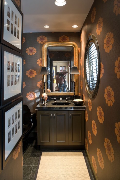
Although this is a rather small gallery display, the powerful artwork is enhanced by the vibrant color and pattern of the wallpaper. Small bathrooms are a great place to experiment with greater contrasts and daring styles. Image courtesy of Berry Construction Group.
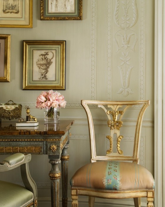
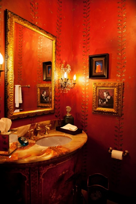
The very traditional artwork, along with equally traditional gilded furniture, deserved a wallpaper that emulated a similar style. This trompe l’oeil wallpaper gives this room the right ambience. Image courtesy of Jane Antonacci Interior Design.
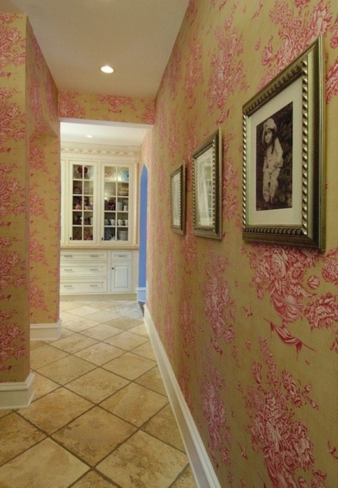
This home features a strong French country theme and this toile wallpaper is perfect for the space. This homeowner chose to unify their gallery art with matching frames and spaced them apart to further show off the wallpaper. Image courtesy of David Stimmel Consulting Group.
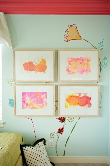
The wallpaper or background wall doesn’t have to match the artwork. In this kid’s room, the bounty of color from the artwork, walls and textiles help to create a fun and whimsical space. The simple blonde frames help unify the artwork and the extra wide, white matting gives necessary space between the artwork and wall design. Image courtesy of Barry Construction Group.
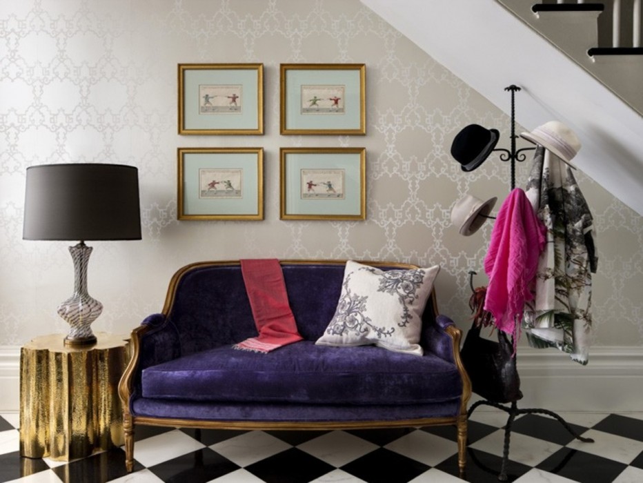
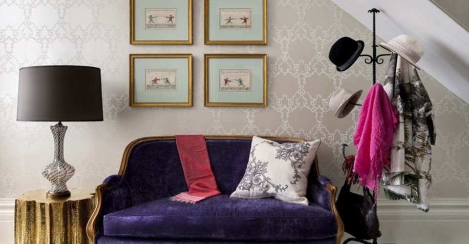
This small gallery grouping helps define this sitting area. Although the wallpaper has a large repeating pattern, there is very little contrast in colors, making for a fairly neutral background. Theses framed images are all nearly the same, and create a very symmetrical pattern within a very whimsical space. Project courtesy of Siemasko+Verbridge.
Need help hanging up your gallery wall? Check out our quick video tips for getting the best display.
Have a project you’d like help with? Have a project you’d love to show off? Email us at editor@porch.com!


