Choosing a paint color for your home sounds simple. But it can be one of the hardest decisions you face when deciding how to update your home.
As color psychologists say, choosing the right paint for you is more complicated than avoiding certain colors. Even blue, supposedly the most calming color choice, can become overwhelming if it’s too bright, and notoriously intimidating red can actually relax you if it’s a rich, subtle hue with cool undertones.
The best paint designs are ultimately whichever one you like and feels right in the room. But here are some tips to help guide you towards the right shade to use in each room of your home.
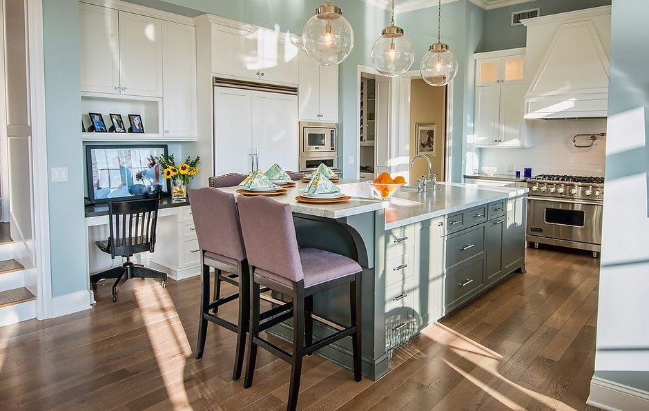
Kitchen
Best bets: Light orange and other citrus colors, cream, blues, or pure white.
Avoid: Black, dark blue, bright yellow.
Warm colors like orange and red stimulate the appetite, making them great kitchen paint colors. If you love vibrant orange shades, try a soft pumpkin or kumquat. Both are lively colors that aren’t too intense. If you prefer something subtler, then consider white, cream, or pale blue. Just steer clear of colors that are both cool and dark. If you are set on going dark in the kitchen, go for a warm, earthy brown, such as Valspar’s Deep Walnut.
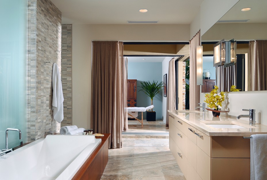
Bathroom
Best bets: White, pastel yellow, peach, neutrals
Avoid: Bright or extreme colors such as red or neons
Soft colors work best for the bathroom. Not only do they relax you, but they also flatter your skin tone. You can’t go wrong with ivory, buttery tan, or gentle rose. In fact, pale yellow and pink paints mimic sunlight—perfect if your bathroom is short on natural light. Soft, neutral shades of straw-like yellow such as Valspar’s Lazy Sun are a great way to get a mood that’s soothing, but still saturated.
If your bathroom is on the smaller side, paint it a light color like white or lemon to make it look bigger. For a coastal vibe, try an airy sky blue. Try painting the ceiling the same color as the walls to prevent the bathroom from feeling smaller than it is; when the eye can travel effortlessly, your space will expand visually.
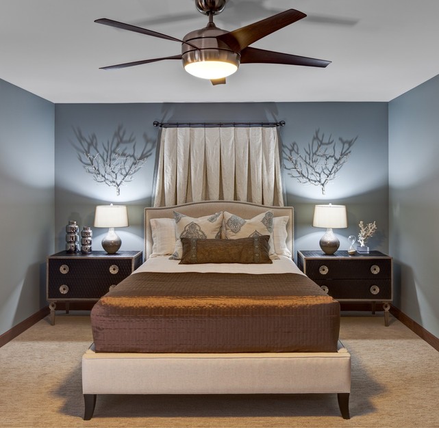
Bedroom
Best bets: Blue, green, silver
Avoid: Cool brown, purple, saturated colors
Blue’s connotations of sky and sea make it inherently relaxing. That’s not just anecdotally evidenced—research shows that people get more sleep in blue bedrooms. Navy’s power to inhibit conversation makes it a bad choice for a kitchen paint color, but makes the same color a great choice for the bedroom. If blue bores you, try a modern, icy gray-green as an interesting take on neutrals. Or go for soothing silver-grey such as Valspar’s Moon Sail.
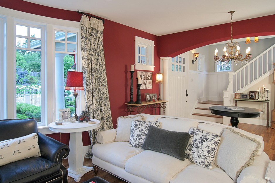
Living Room
Best bets: Maroon, dove gray, teal, white
Avoid: Fire engine red, bright yellow
Red’s stimulating properties make it work in the living room, unlike most other rooms. Just avoid fire engine red, which is so stimulating that it could keep you from relaxing. Instead, go for a muted red such as Valspar’s Claret, which is a near-perfect match for Marsala, Pantone’s 2015 color of the year. If you must have bright red, save it for small accents, such as vases or art pieces. If you want something subtler in the living room, a wonderful alternative to red is pale gray paint, which allows your decor to stand out.
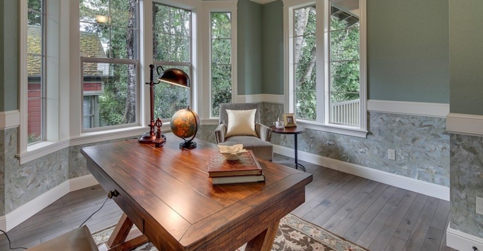
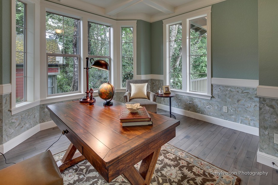
Office
Best bets: Yellow, green, light blue
Avoid: Navy, black, pure white
Yellow paint wakes you up and helps you focus, making it a good choice for the office. Shades of green, such as Valspar’s Rosemary Sprig, also help your brain avoid distractions, even if it’s just a few plants here and there.
As always, remember that paint will definitely look different on your computer screen, on a swatch, and on your actual wall. Most paint stores sell small samples for a few dollars so you can easily paint splotches on your wall before committing to a gallon or more.
What are your favorite paint colors? What colors would you love to try in your home?

